By Alex Ababio
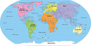
When you look at a standard world map hanging in classrooms, boardrooms, or scrolling behind news anchors, what do you see? If it’s the familiar Mercator map, you’re viewing one of history’s most controversial map projections—an image that subtly warps our perception of global power and identity. In classrooms across Africa, this distortion quietly tells millions of students a story: that their continent is small, marginal, and less significant.
That narrative is shifting. The African Union (AU) has recently thrown its full support behind the “Correct The Map” campaign, demanding an end to the widespread use of the Mercator projection by governments and international organizations. In its place, the AU—and a growing chorus of cartographers, educators, and activists—are championing the Equal Earth projection, a modern, equal-area map that reflects Africa’s real scale.
What’s wrong with the Mercator map?
Cartographer Gerardus Mercator created this projection in 1569 to help sailors navigate by preserving straight-line rhumb lines. But that navigational convenience came at a cost: distortion. The Mercator inflates land near the poles—making Greenland appear nearly the same size as Africa when, in reality, Africa is roughly fourteen times larger. This visual exaggeration gifts disproportionate presence to Europe and North America, while diminishing the mass of South America and Africa.
AU Commission deputy chairperson Selma Malika Haddadi told journalists bluntly, “It might seem to be just a map, but in reality, it is not.” She condemned the Mercator’s false impression that Africa is “marginal,” calling it a form of “visual misinformation” that seeps into education, media, and policy-making.
These distortions are not just academic—they shape how entire generations understand geography, history, and power.
“Correct The Map” reignites the debate
Although Mercator’s flaws have been known for decades, the Correct The Map campaign, launched by advocacy groups Africa No Filter and Speak Up Africa, has revived the debate with urgency and clarity. Their call: echo the Equal Earth projection, introduced in 2018, which preserves accurate land size while maintaining a visually appealing globe-like structure.
Moky Makura, executive director of Africa No Filter, framed it this way: “The current size of the map of Africa is wrong. It’s the world’s longest misinformation and disinformation campaign, and it just simply has to stop.”
Meanwhile, Fara Ndiaye, co-founder of Speak Up Africa, emphasized the human cost: “We’re actively working on promoting a curriculum where the Equal Earth projection will be the main standard across all (African) classrooms.” She acknowledged how Mercator’s distortions “affect Africans’ identity and pride,” particularly among children.
Equal Earth: maps with integrity
So what makes Equal Earth different? Crafted by Bojan Šavrič, Tom Patterson, and Bernhard Jenny, the projection was designed with one goal: retain accurate relative land sizes while softening visual distortion. It mirrors the curved shapes of familiar world maps while delivering a truthful representation of continental size.
Tom Patterson, one of the creators, explained that Equal Earth was “designed to maintain the true relative sizes of the earth’s features,” a clear rebuttal to the skewed reality of Mercator. It’s a compromise between function, familiarity, and fair representation.
Cartographic historian J.B. Harley once remarked, “maps are never value-free images of reality.” That insight drives today’s campaign: challenging a centuries-old projection that subtly reinforces colonial-era power structures.
From classrooms to tech platforms
Despite growing criticism, Mercator isn’t going quietly. It remains a mainstay in schools and maps, especially online. In 2018, Google Maps introduced a 3D globe view on desktop, a step toward reduction of distortion. As a company announced, “With 3D Globe Mode on Google Maps desktop, Greenland’s projection is no longer the size of Africa.”
But the Mercator lingers online—especially on mobile devices, where Web Mercator is still the default for most interactive mapping applications.
The Correct The Map campaign has already sparked institutional change. The World Bank confirmed it now uses the Equal Earth or Winkel-Tripel projections for static maps and is phasing out Mercator for web mapping systems. A formal request to the UN’s geospatial authority, UN-GGIM, is in the works, and experts must now review it.
Reclaiming Africa’s global presence
For the AU, this demand has political significance. Haddadi stated the campaign “aligns with its goal of reclaiming Africa’s rightful place on the global stage” amidst mounting calls for reparations and historical justice. She plans to mobilize member states to adopt Equal Earth collectively.
Support is also emerging from beyond the continent. Dorbrene O’Marde, vice-chair of the CARICOM Reparations Commission, endorsed Equal Earth as a powerful rejection of the Mercator’s “ideology of power and dominance.” It’s a gesture aligning Caribbean reparations advocacy with Africa’s fight for visual and geopolitical equity.
Why this matters—and how to join the push
The distortions of the Mercator map are more than historical artifacts—they are blueprints of influence. They make large northern countries appear grander, and African nations appear smaller and less consequential. That’s why this isn’t just cartography—it’s a matter of perception, pride, and power.
Educators: Push to replace Mercator maps in schools with Equal Earth. A more honest map doesn’t just teach geography—it reinforces a continent’s rightful place.
Policymakers: Advocate for Equal Earth across government publications, aid charts, and strategic planning materials.
Developers: Introduce Equal Earth in digital tools and apps, or at least offer it as an easy alternative to Web Mercator.
Institutions: Join the World Bank and others in dropping Mercator for good. The Correct The Map campaign provides templates and model policies.
The bottom line
Maps shape our worldview—literally. The decision to move past the Mercator map isn’t just technical; it’s symbolic, practical, and urgent. With the African Union backing, and growing support from international actors, the Correct The Map campaign is writing a new chapter—one where Africa’s true size, importance, and influence are finally given the recognition they deserve.

